The best way to think of your web design/theme is your shopfront (aka brand identity) whether you are an e-commerce website or an information portal. Your web design is the first thing visitors will see. So, if they like the colours, style and the way it is laid out then they will come in. If it sends the wrong impression, looks too cluttered, they may go to your competitor. There are of course many other factors to take into consideration, such as navigation, web hosting, SEO and mobile compatibility but don’t lose focus on your theme.
There is no doubt that when building your website, choosing the correct theme is vital to attracting traffic and keeping visitor interest. You need to pick the right style, colours, font and level of interaction. When we look at content management systems such as WordPress there are many options available. If you website themes you will see there are literally millions of websites. They showcase fairly simple to interactive and relatively complicated website themes.
To demonstrate the process of picking an appropriate theme for your website is to look at the options on WordPress.
Table of Contents
Style to suit your industry
Prior to setting up your website you will likely have done in-depth research into your industry. Study elements like potential customers and likes/dislikes before choosing a theme. However, to lay the foundations for an appropriate, useful and long-lasting website theme pen-down your needs.
Subjects to consider include:
- Colours
- Images
- Style including fonts
- Interaction
- Responsive design/mobile compatible
- User-friendly
- Theme specifications
- Compatibility with base code such as PHP
- Widgets
These are obviously fairly straightforward subjects. However, once you begin to write down your preferences , you will see the basis of a theme specification come together.
Choosing a theme
Take WordPress for example, it uses a straightforward way of choosing a website themes. Once you log into the backend dashboard you will be hit with a myriad of options. The dashboard homepage prompts you to consider an array of different options. You can see the navigation bar below.
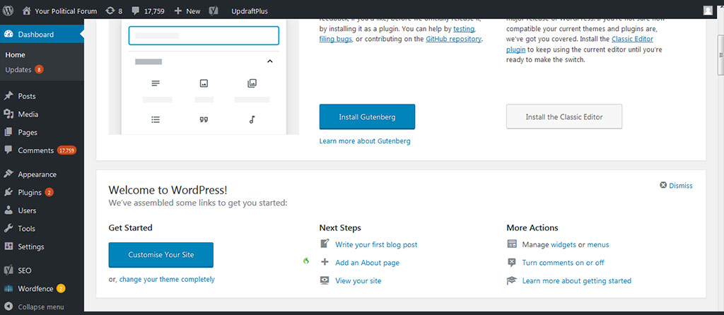
If you select the appearance option in the menu on the left-hand side this will take you to the section where you can choose your theme and various elements which impact how it will be displayed.
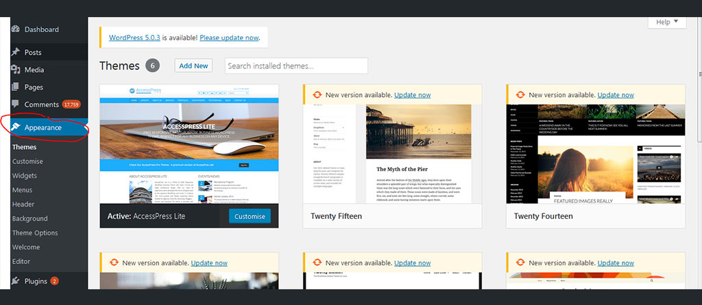
The first thing you will see with WordPress is that there are some standard theme options already preloaded with the package. Perhaps if you are in the prelaunch stage and have not yet decided on a theme, but have content you would like to add to the website, you could pick a relatively basic theme while your site is indexed on the search engines. Some may describe this as a soft launch ahead of a full promotion, updated website theme and the release of more pages and more content.
Selecting a new theme
In the example above you can see that the theme which offers a “customise” button is live. This is the theme being used at the moment. When you are in a live WordPress system you simply hover over the other listed themes. If you wish to change themes, just click on the new theme to apply it. It is worth noting, for those with a little more experience with coding and theme designs, you can make significant changes to the individual themes by adjusting, adding and deleting code on the source pages.
Unless you have experience in this field, it is probably worthwhile using one of the standard packages or hiring a specialised designer to customise or create your own theme. Unique themes can also be uploaded to your website using the option on the appearance page.
Theme specifications
As you hover over each individual theme you will notice the appearance of a “theme details” option. If you select this, you will be taken to a page which shows the theme in more detail. Theme specifications and general information from the designer is on this page. The majority of themes also have a link back to the designer’s webpage were more information will be made available. As a matter of course, each of the themes in your dashboard will alert you if there have been any updates with the option to update your theme. Updates often help to improve security as well as compatibility with various browsers, mobile devices, widgets and plug-ins.
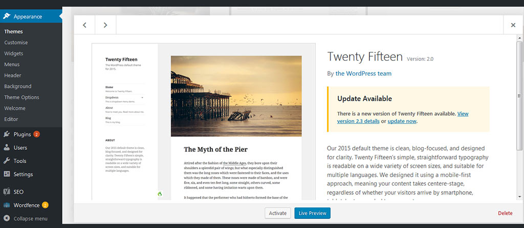
There will be occasions where the preloaded themes do not fit in with your required style and structure. As we mentioned above, due to the open source nature of WordPress there are literally thousands and thousands of different themes available.
Searching for themes
You might have come across websites which look and feel very similar to what you are looking for. Thankfully, there are very simple but very effective theme search options online. To utilise the search facility simply click on the “add new” button just above the screen shots of the preloaded designs.
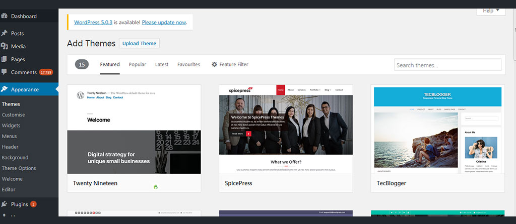
You will then see various options such as featured, popular, latest, favourites and a feature filter – together with a simple theme search option. One very simple but effective tip, if you are looking for a site which may be suitable for a business website then enter business in the theme search box. While not always the case, you will come across many theme names which refer directly to their focus market. It is also interesting to take a look at the featured sites, popular and latest to give you an idea of what is on trend and proving popular. That is not to say you should feel pressurised to go with the latest trends but it does give you an idea of themes and designs which have been well received.
Featured filter option
The featured filter option is a priceless search facility which allows you to cut through the thousands and thousands of designs available, to ones that match your specifications. When you click on the featured filter option you will see the following options:
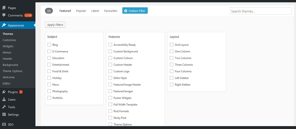
You can search on a variety of different theme subjects from simple blogs to photography, education to entertainment. You can then dig deeper for chosen subject themes which have a variety of features such as the option to customise the background colour, featured images, footer widgets, custom logo, etc. Then we move on to the simple layout options, from a grid type layout to anything between one column and four columns with or without left/right sidebars. After using the search facility a few times you will very quickly see how powerful this is and how it is able to align actual theme searches with your specifications.
If for example you want to look at themes which:
- Target blogs or education
- Offer the ability to customise the background, colours, header and logo
- Have three columns
- Incorporate a left and right sidebar,
You will notice that all of the filters you have added are listed just above the minimised theme screenshots – you can edit these variables on screen. In this instance there are 16 themes which match our requirements as listed above. Once you have chosen your theme you can customise an array of different elements such as colours, logo, etc.
Customising your website theme
You will notice on the left-hand side just below the themes option there is a customise menu option. If you click on this it takes you to an interactive version of your basic website. In this section you can change a whole array of elements. The left-hand menu will look like this:
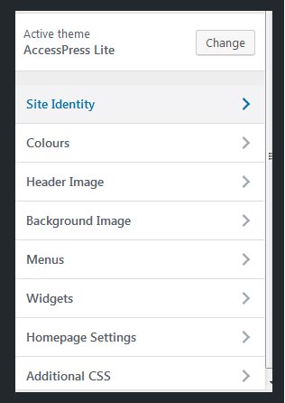
You will see the name of the active theme and various options which allow you to change everything from the menu setup to widgets used, from the colour palette to the title and tagline as well as various home page settings. For example the site identity option (effectively the start of your brand identity) will look like this:
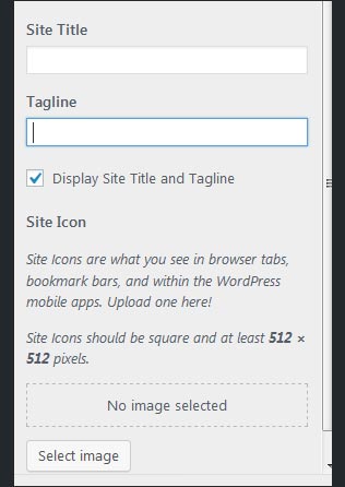
Once you have added the site title, tagline and any logo image you simply click on the publish button which is located to the top of the screen. When looking to change colours simply select the relevant option and with this particular theme you will be able to change the header and background colours:-
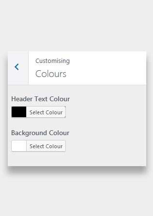
These options are extremely simple and as you work your way down there will be useful notes and assistance to help you. If you have any questions or queries you should probably speak with a specialist so that your site eventually looks exactly how you imagined.
Widgets
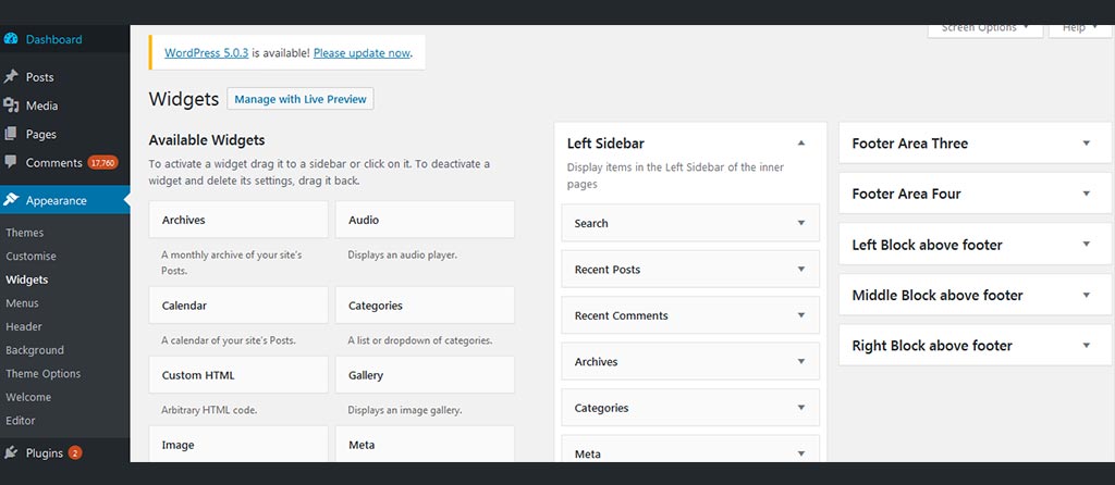
There is another important subject to cover with regards to WordPress themes which is the use of widgets. As we touched on above, WordPress is an open source system therefore there are literally thousands of different widgets available. They can do something as simple as showing different categories and sub-sections to cloud tags, images, video displays and much more. You will have the ability to select and deselect, adding them to headers, footers, left and right side menus.
To give you an idea, the standard widget page will look like this:-
If you use Google Analytics you will be able to see which pages and which elements of particular designs are proving popular. This may prompt something as simple as a basic tweak or you may look for a more appropriate WordPress design. It is also vital that you monitor heat maps, popular pages and the duration of visits as these will all help to determine if your design is working and complimenting your content and subject matter.
Responsive design
Recently we saw a significant switch in surfing habits with more than 50% of Internet visits now carried out via smart phones or tablets. This means that the use of a responsive web design, which basically changes shape and structure depending on the device from which it has been accessed, is vital. Indeed search engines now incorporate mobile compatibility within their algorithms as this is now an integral part of the overall user experience. If you think creating a responsive design is something you can do at a later date, think again!
Smartphone and other mobile devices such as tablets are the way ahead for both e-commerce and information websites. If your web design/theme is not compatible with these devices then you could be missing out on potentially huge traffic.